Am I Overthinking This? by Michelle Rial

Am I Overthinking This? is a delightful book of 101 infographics. In the introduction, Michelle Rial explains that she was an information graphic designer whose chronic pain removed her from the field… and that this was her response.

This is the perfect coffee table book for the introverted UX designer who thinks way too hard about the little things, like:

  • Where are my hair ties?
  • Is brunch fiscally irresponsible?
  • Are people judging me by my desk?
  • Is it too late to start?
  • Am I a bad friend?
  • How much do I tip for this?
  • How do I stay calm?

Michelle uses everything from water colors to markers to hair ties, matches, and Chinese food take-out boxes to create the info graphics that are in the book.

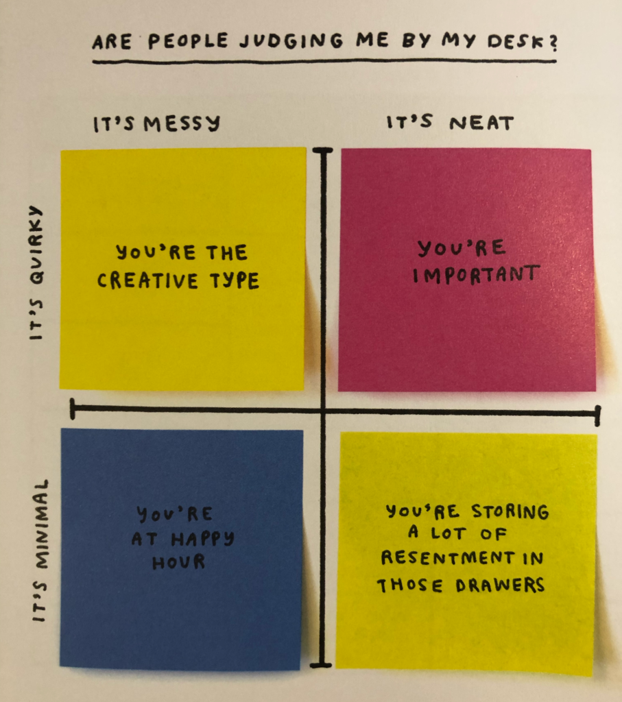
For example, here’s “Are people judging me by my desk?”

Photo of the book page. The quadrant chart can be broken down to the following desk value combinations. Mess and quirky: you're the creative type. Neat and quirky, you're important. Messy and minimal, you're at happy hour. Neat and minimal, you're storing a lot of resentment in these drawers. The chart axis and labels are drawn on a piece of paper, but each of the values (which fills its whole quadrant) is a post-it note.

If you are an overthinker, or you are an information designer, or you just like charts (or you know anyone who fits any of these combinations) this is a book worth buying. I foresee using it to hand out “advice” to many of my friends in the future.

Fighting the color wars

see caption
A screenshot of two items in my grocery store’s online ordering system. One is red, the other green. Guess which one is on sale?

Colors carry the weight of a culture with them whether we like it or not. They also carry the weight of the user’s previous experience.

My grocery ordering system, Peapod.com, is doing a fantastic job of proving this true, to their detriment, right now. I’m in America, where red means “stop” or “don’t do it” or “negative consequences”. In the financial industry, for example, it’s generally used for a market loss (generally considered a bad thing). In traffic, it means stop. In the office, it means “power” or “aggression” – men wear their red power ties and a woman in a red dress is trying to stand out.

Only in our Chinese (or similar) neighborhoods is it considered lucky or good.

Green on the other hand, means many positive things – a gain in the financial markets, the ability to “go” in traffic, a soothing and natural and back-to-nature feel in most other things.  Green paint is calming, green foods are healthy, green means good.

And yet… maybe to give all prices a sense of good?… all of the prices of food at Peapod are in a green font. That’s an interesting design challenge right there. If someone insists all prices are good, and green indicates good, then it makes sense that all prices would be green. But then when something goes on sale, that’s better than good… but there is no greener green (or at least Peapod doesn’t use one)… so items on sale are… red?

The red certainly stands out against a sea of green prices, but rather than encouraging me to buy, it throws me off. I don’t want the red thing, red is bad, except here red is good, so I do want the red thing, but red is bad, and ow my head hurts.

If it were me, and it’s not, I’d fight hard for “normal price” being black and “sale” being green and maybe “super sale” being extra bright green or something. Because fighting an entire culture of learned experience in a design is a difficult position to win.

Now on The Interconnected: Black is the New Black: Navigating in Black and White

My March 25 post on The Interconnected is about a disturbing trend I recently noticed in website navigation. Everything’s gone black and white.

Well, dark grey and white.

And that’s fine if you don’t need anyone to figure out what’s clickable on your website, but, well, we invented the hyperlink for a reason, and the reason wasn’t “to make you stab wildly at a page until you figure out what’s interactive”.

Go check it out.

Full Stack of Something

Here’s the thing that’s hurting my head today: the “full stack developer” job listing.

A Full Stack Developer is someone who can develop at every layer of the software development stack, from the servers to the front end. This includes:

  • Server, Network, and Hosting Environment.
  • Data Modeling
  • Business Logic
  • API layer / Action Layer / MVC
  • User Interface
  • User Experience
  • Understanding what the customer and the business need.

My role as an Information Architect lands firmly inside of the sixth one down, “User Experience”, and often I’m not the Information Architect on a project, I’m the User Experience Designer. (Even as an Information Architect there are expectations that I can talk fluently about the business logic, user interface, and customer and business needs, so the User Experience container is by no means leakproof.)

User Experience is a huge field of study in and of itself. In the “tradition” of the Full Stack Developer posting, I suspect we should call ourselves “Full Stack Designers” instead of User Experience Designers, because it gives a much better impression of our wide range of responsibilities, which include:

  • Information Architecture
  • Architecture
  • Content creation
  • Visual Design & Information Design
  • Human Factors
  • Industrial Design
  • Interaction Design
  • Human-Computer Interaction
  • Sound Design
  • Interface Design
  • Usability Engineering
  • Content Strategy

…and probably more than I can’t think of.

Each of the topics that makes up a Full Stack Designer can be (and in many cases is) its own full career with its own full educational system, training, and roles in an organization.

For example, I’m thoroughly well-versed in Information Architecture and Interaction Design, comfortable in some of the Usability Engineering methods and knowledge and some of the Content Strategy methods and knowledge (but not others), and not as deep in Visual and Information Design. I can’t even comfortably say I’m a Full Stack Designer (since I’m aware of my own weaknesses and imposter syndrome is a thing).

I suspect the same thing is true of all of the other traits that a Full Stack Developer is supposed to be familiar with.

So how in the world is someone supposed to be a Full Stack Developer and be set up for success by their employer? Is it a significant reliance on vendor products, frameworks, and external knowledge? Is it by only building small websites? I’m baffled.

And suspicious. I should add that I’m suspicious, because to do six careers well takes a lot of time, and while it might come with a lot of salary, I’m having trouble imagining it comes with a lot of sleep. Hustle is hype, and anyone who’s told me otherwise was trying to pay me one salary for at least two jobs worth of work.

Me, I’m happy with one job that pays the bills, the occasional vacation, and a few pinball tournaments or races or Phillies games. And as much as I believe that there’s space for both specialists and generalists (and maybe even a few compartmentalists) I’m also quite a bit worried that anyone working six career paths under one job title is, well, over-generalizing.

I’m worried about the Full Stack Developer precisely because it includes the Full Stack Designer. If an employer believes that the 8+ specialties in my field are nothing but a subset of skills for someone who is already doing 5 other jobs, then what do they think of hiring someone in my field? Are you specializing in IT by being a generalist in Design?

I don’t have answers, just a headache, and an observation that this “full stack” world seems awfully general.