I am not trained in graphic design, but I have picked up some bits and pieces along the way. I’m occasionally contacted to provide a logo or image for a website or business. That work, where permission’s granted, is represented here.
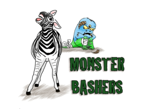
Starting with the most recent, in 2016 one of my best friends was diagnosed with a neuroendocrine tumor. The Philadelphia Zoo holds a fundraising race on site each November called Run for the Stripes. My friend requested I create a tee shirt image she could use for her team.

The intention of the logo was to show that those who were raising funds to defeat the “monster” of NET cancer would be triumphant even if the monster wasn’t killed. (NET doesn’t currently have a cure, although its symptoms can be lessened and growth delayed.) NET survivors use zebra stripes to represent their cancer similar to the pink often used to represent breast cancer, so a zebra is frequently used to represent NET.
For the monster, I am clearly influenced by The Muppets. I was also influenced by the fact that my friend’s daughter was around nine years old, and my friend requested that the monster not be so scary that it would scare her daughter.
My friend and I cycled through a number of different fonts and colors for the team name, so its choice is mostly driven by her aesthetic desires.
Could this be a better logo? Probably. Did it make my friend smile and is she happy with it? Definitely. This design is a full success.
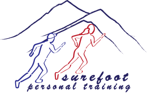
In 2008, the owner of Surefoot Personal Training wanted a logo for shirts and business cards that would represent her personality. She wanted simplicity, both so the design could be used in multiple sizes, and so that it could be printed with a minimum of colors. Her original request was for two individuals jogging in the Colorado Rockies, but they needed to look dynamic and active and fit, and the design needed to incorporate the name of the business. She also required a thick, solid font to represent the solidity of the business and to make it easier to read from a distance.
Looking back on it today, I’d probably tighten up the kerning on the text and do a better job of aligning the two lines on the right side. The light blue runner’s connection with the dark blue mountains is less than ideal — I should have either committed to overlapping the mountains or provided more space above. But otherwise, it’s a pretty solid piece and the client was thrilled.
From 2005-2007, I was a member of a loosely-knit organization of online comics writers (back when the idea of drawing comics and posting them online was still a wild and crazy thing to do). Each year the comics industry celebrates Free Comic Book Day on roughly May 5th. For a number of years we worked to draw attention to online comics (which were generally free all around) and boost our readerships.
In 2007 I volunteered with one other comic artist to maintain the Online Comics Day website (which is now sadly defunct). Together we converted the manually-created site into a WordPress installation with a custom theme. Our theme was something along the lines of “a new day” and we wanted to impress on readers that the world of webcomics was an up and coming one:
The biggest problem with this design is the obvious fact that it does not, in any way, tie back to online comics.
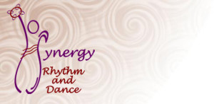
In 2006 I was contacted by the owner of Synergy Rhythm & Dance, a dance studio specializing in belly dancing, for a logo and site background. She had sourced the background pattern she wanted, which is incorporated below. She had also created a hand-drawn sketch of her logo, and wanted me to “digitize it” so that she could use it for the business. She provided color codes and preferred fonts. The owner’s goals for the logo were to represent belly dancing as a source of exercise and fun, and not as an exotic dance type.
There wasn’t a lot of wiggle room for creativity on this one. It was essentially draw-by-number to satisfy the client, and I did exactly that.
Looking back on it now, I fear it looks more like a bowling pin than a dancer, and I probably should have worked with her to adjust that. The various ovals are slanted in all kinds of different directions, which distracts from the flow of the shape, and there’s no real direction for the eye to follow. Ah, to have the knowledge then that I have now!


