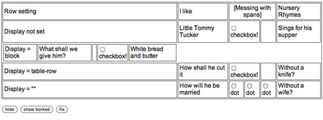
Let’s say you have a table of data, and you have a requirement to hide some or all of the data by clicking some “hide” or “show” links. If your data is only one-tier, it’s pretty easy to do. You can wrap the rows that you want to hide or show in a <tbody> tag and use that tag to make the rows it contains display or disappear. Here’s an example.
But while a <table> can have multiple <tbody> tags, they have to be stacked, they can’t be nested.
Good:
<table>
  <tbody>
    <tr>...</tr>
    <tr>...</tr>
  </tbody>
  <tbody>
    <tr>...</tr>
    <tr>...</tr>
  </tbody>
</table>
|
Bad:
<table>
  <tbody>
    <tr>...</tr>
    <tbody> <!-- ack! -->
      <tr>...</tr>
      <tr>...</tr>
    </tbody>
    <tr>...</tr>
  </tbody>
</table>
|
So what to do when someone designs a table that has multiple levels of expand and collapse and asks you to build it?
(A valid answer is “ask them if they really honestly truly need that much info at one time, because I mean c’mon really? There isn’t an information architecture solution better than that? Are they crazy?” but alas, sometimes that doesn’t cut it.)
If you knew that every time you needed to hide the subcategory’s rows you’d be hiding the same number of rows, you could write a function that accepted exactly that number of rows:
function hide3rows('ID1', 'ID2', 'ID3'){
  document.getElementById('ID1').style.display="none";
  document.getElementById('ID2').style.display="none";
  document.getElementById('ID3').style.display="none";
}
But I tell you as soon as you do that, some pest is going to come along and change the requirements to more rows or fewer rows, or sometimes six rows and sometimes eight. And you certainly don’t want to spend your time building a library of hide1row(), hide2rows(), etc. because you need that free time to follow around the person who wrote these requirements so you can keep asking them if they are in fact crazy.
This is where variadic functions come in. A variadic function is one that accepts a variable number of arguments. Generally, it does the same thing to all of the arguments, like add them together, or print them, or in our case figure out which elements they refer to and change their display attribute from visible to hidden. Different languages support variadic functions in different ways. JavaScript actually makes them pretty easy to use, by treating the arguments passed to the function like an array, so we can check the arguments/array length and iterate over its elements.
function hideThings() {
  for (var i = 0; i < arguments.length; i++) {
    document.getElementById(arguments[i]).style.display='none';
  }
}
Here’s our previous table modified to use this function.
Now we can call our hide function with as many or as few arguments as we need to hide. hideThings(‘mon’, ‘tue’, ‘wed’, ‘thu’, ‘fri’); is just as valid as hideThings(‘birthdays’); and we don’t need to clutter up our files with sixty five versions of the same function.


